
Birds Barbershop
Twenty years. One brand. Nine locations — and growing.
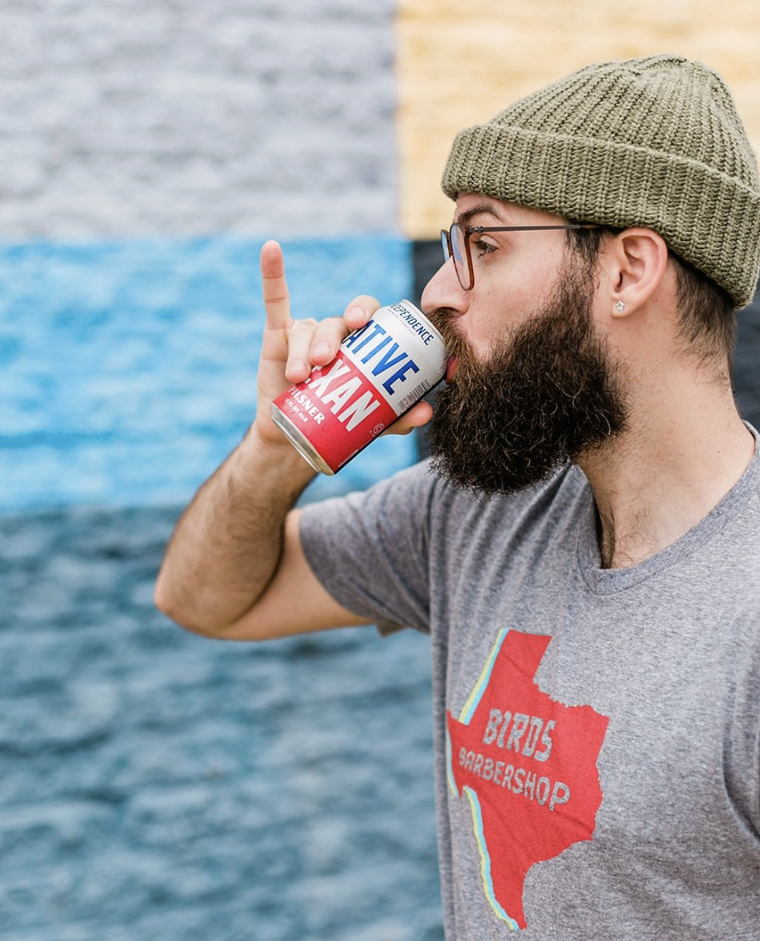
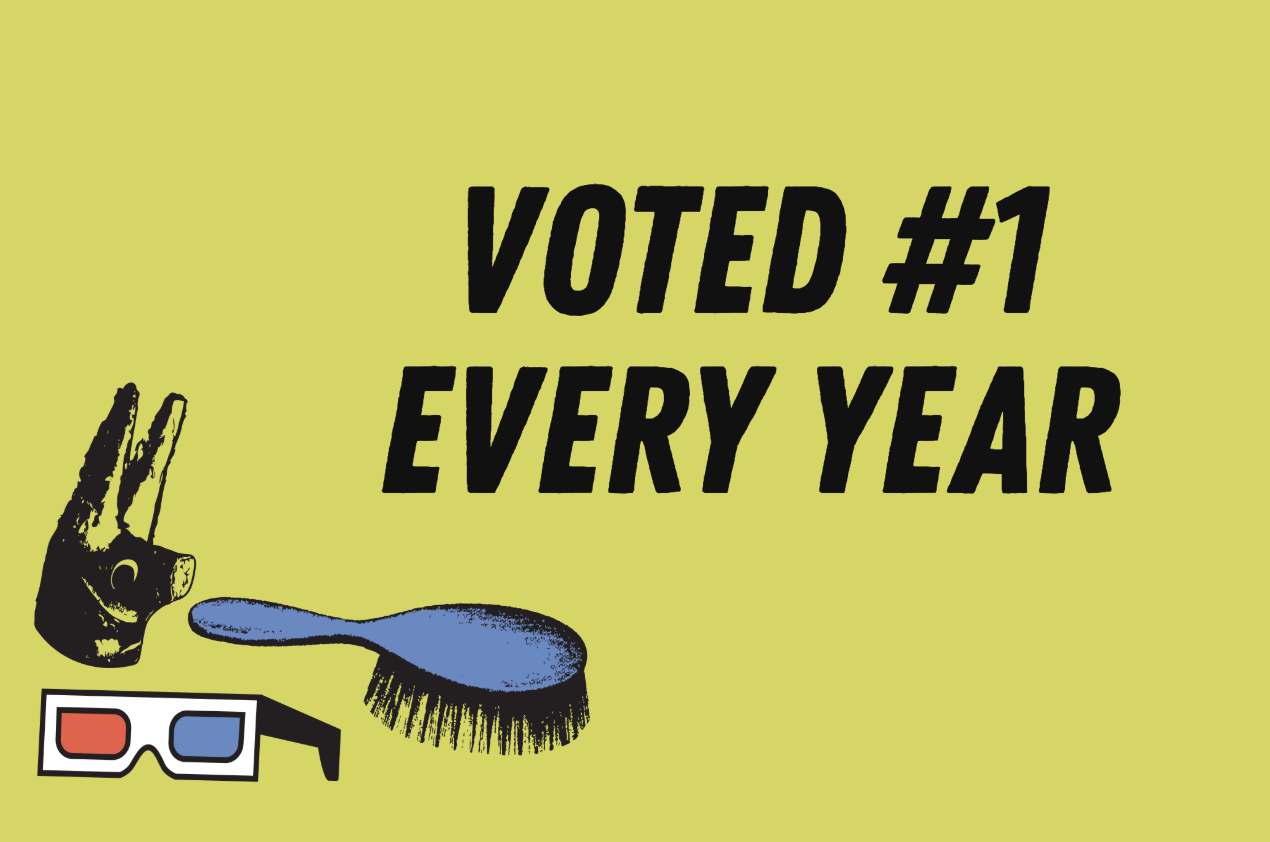
Birds Barbershop has been part of Austin's culture since 2006 — growing from a single neighborhood shop into one of the city's most recognized service brands, now serving more than 20,000 customers a month across nine current locations — and voted Austin's “Best Barbershop” by Austin Chronicle readers for 19 consecutive years.
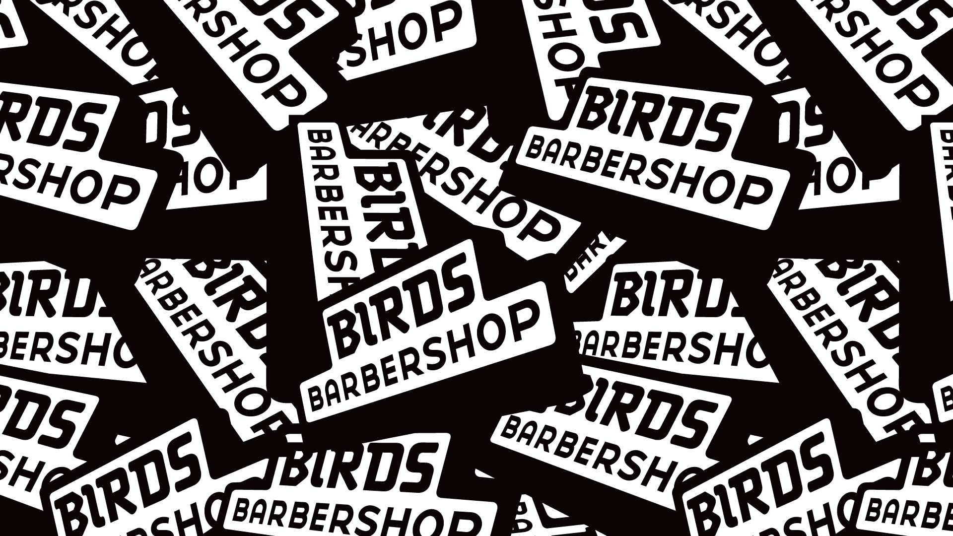
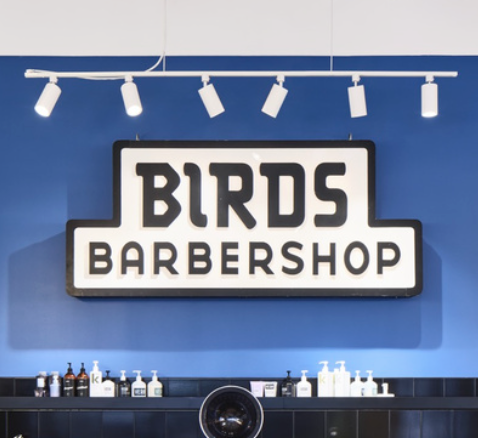
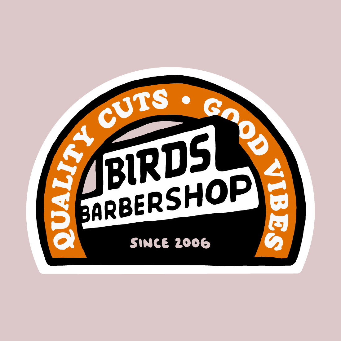
I've been Birds' creative partner since the beginning. I designed the logo and established the visual system that still defines and expands the brand today — across stores, campaigns, social, and physical environments.

“Our company’s logo came from his classically modern inkwell, as did multiple large-scale mural installations. We owe a lot of our brands’ depth to Bryan—and will work with him until he gets too famous for us.”
— Michael Portman
Co-Founder of Birds Barbershop
A visual language
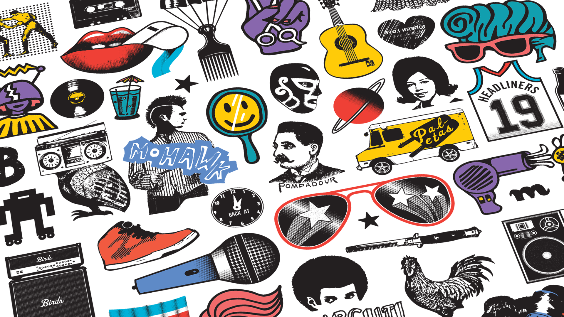
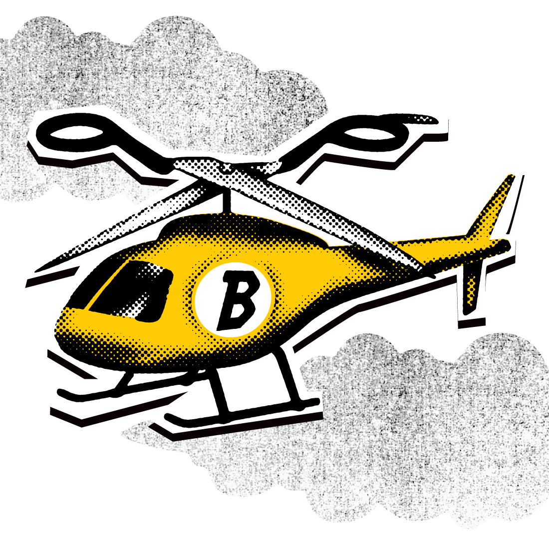
At its core, Birds is a visual language—built from repeatable elements, flexible rules, and a point of view that carries across everything from social campaigns to large-scale murals.

Over time, the work has become an act of cultural calibration—continually fine-tuning the brand to its environment, audience, and moment while keeping it unmistakably Birds.
The Birds Experience
Across Shops, Ephemera, and Digital Messaging
— THE BIRDS EXPERIENCE —
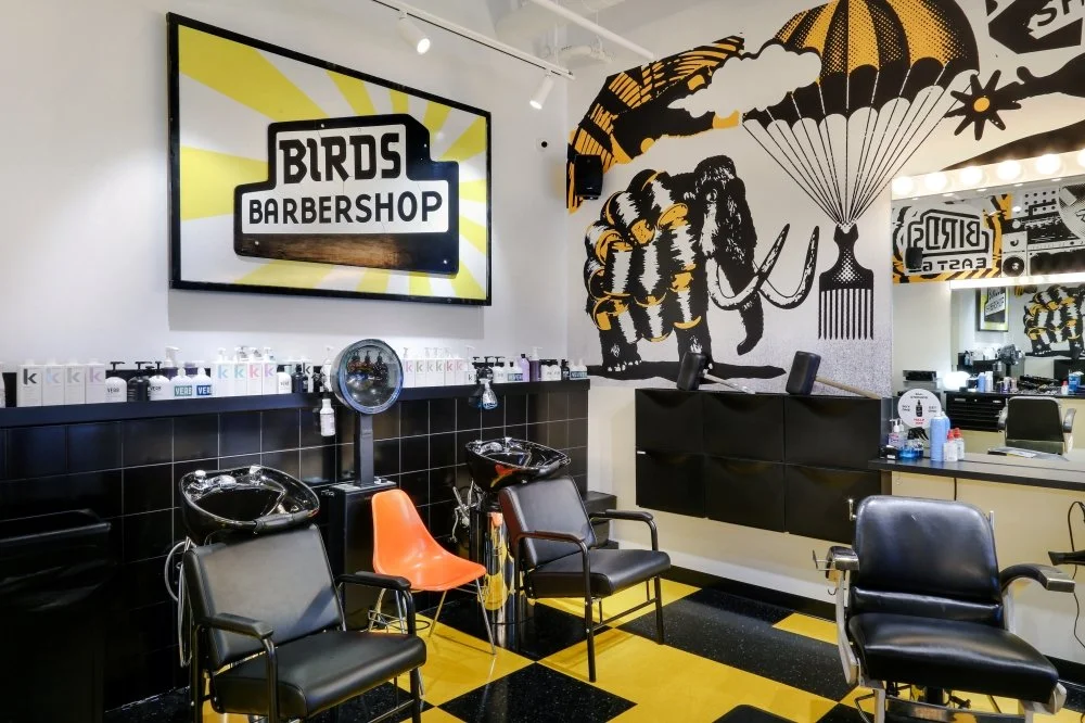
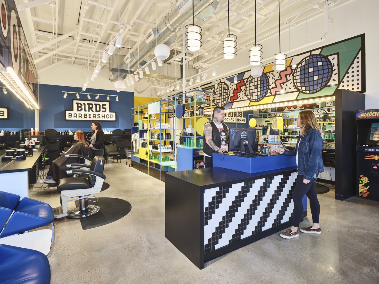
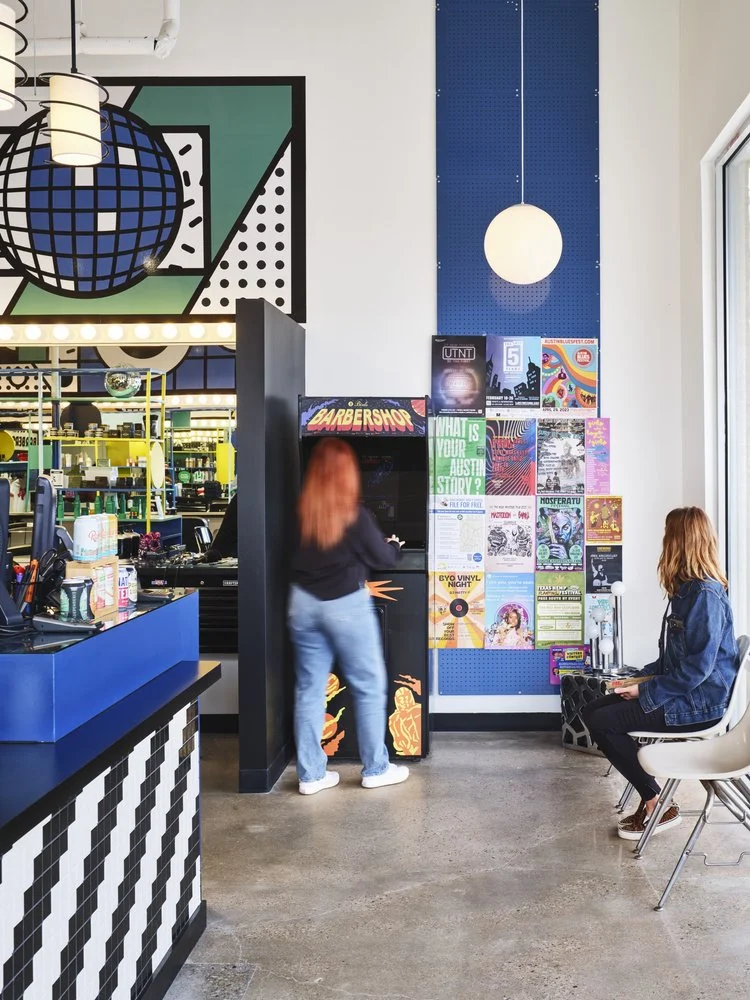
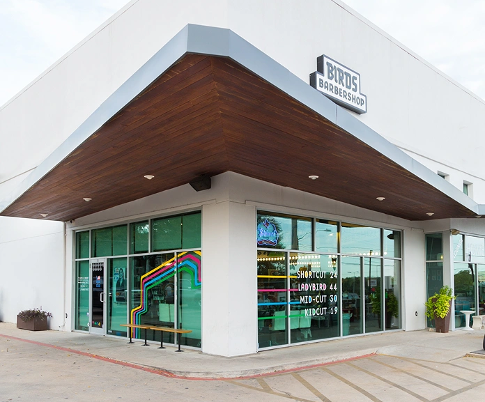
Shops
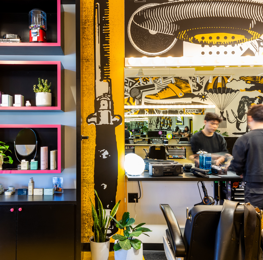
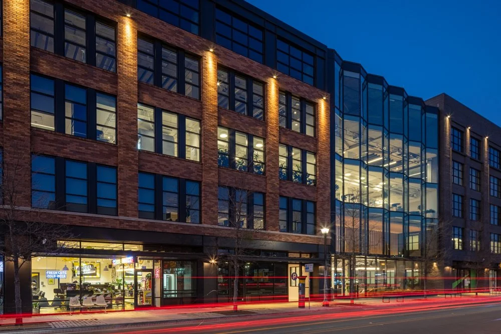
Birds shops are built as environments, not just places to get a haircut. The visual language expands across walls, mirrors, and moments in the space—creating something people experience, not just pass through.

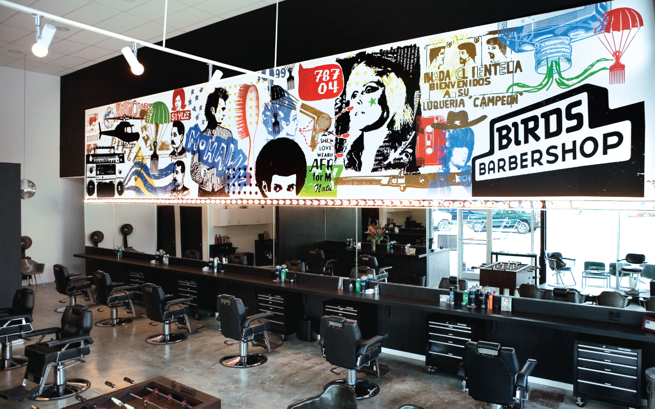
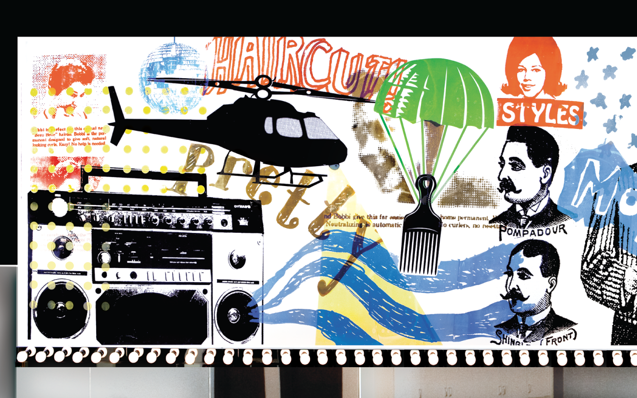
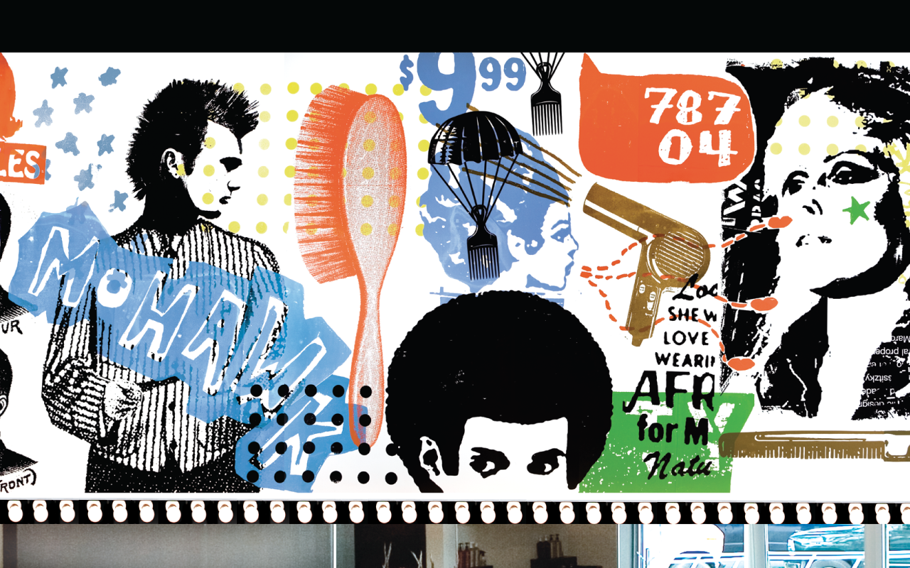
1401 East 6th Street
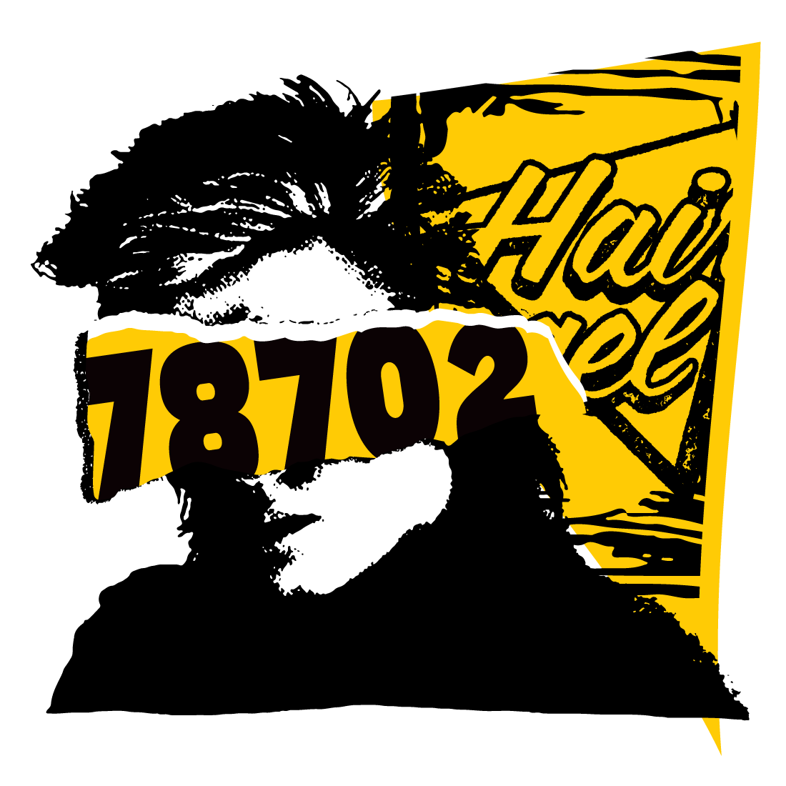
Inspired by photocopied textures and collage, the East 6th shop leans into density and motion—layering imagery to match the energy of the neighborhood while staying anchored in core Birds iconography.
Architecture & Interiors: Mark Odom Studio
Shop Photography: Anna Blackard

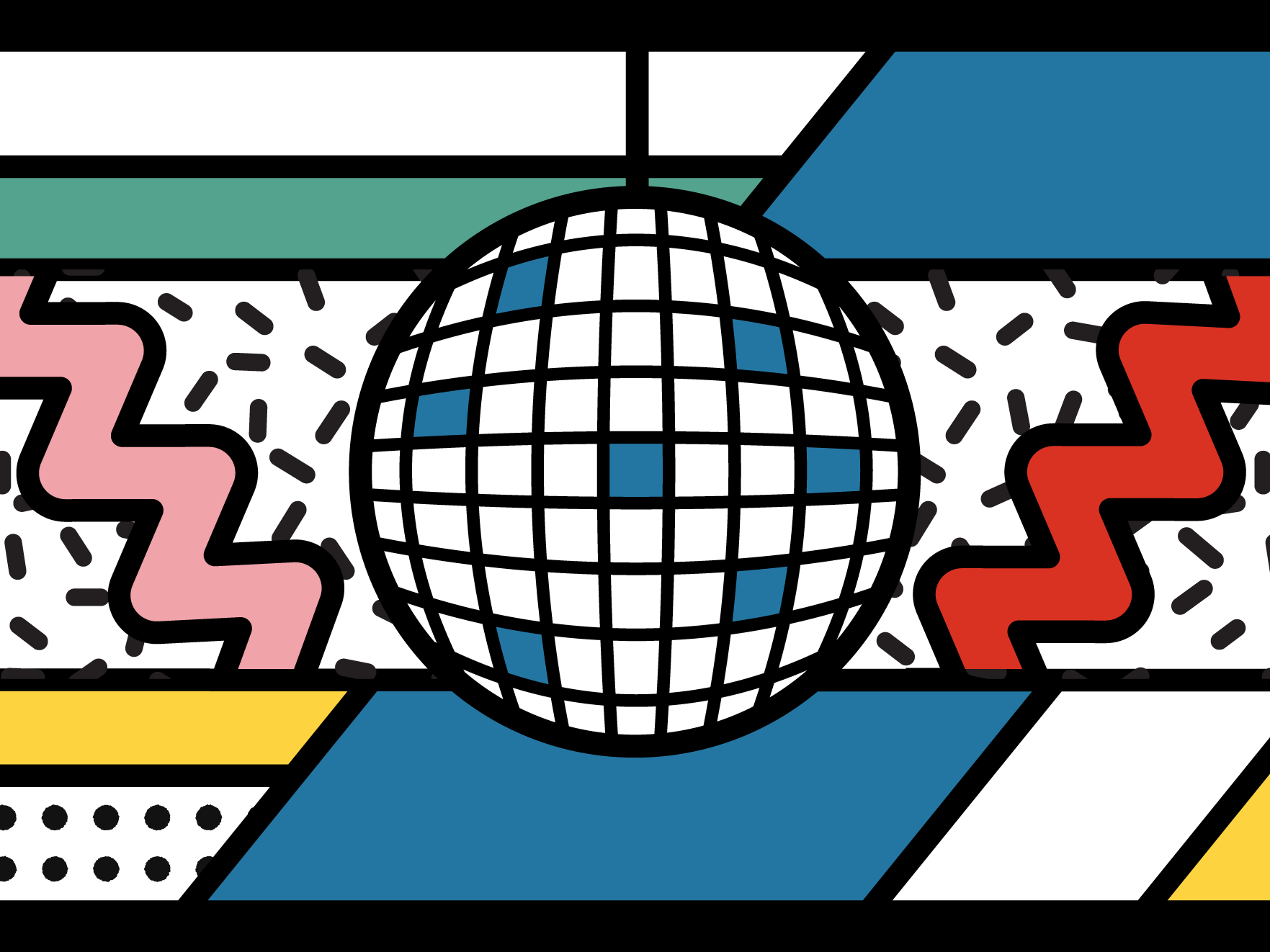
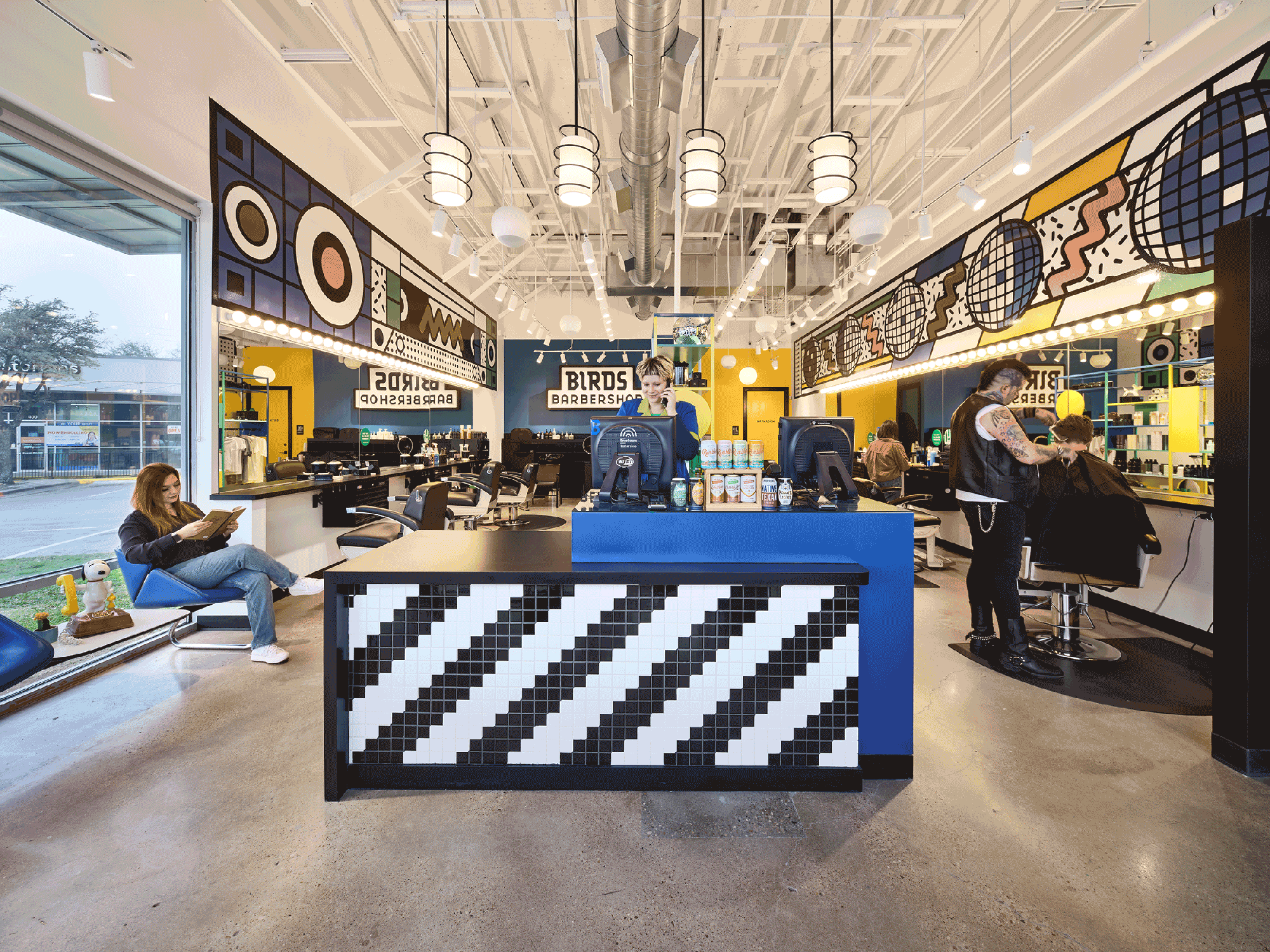
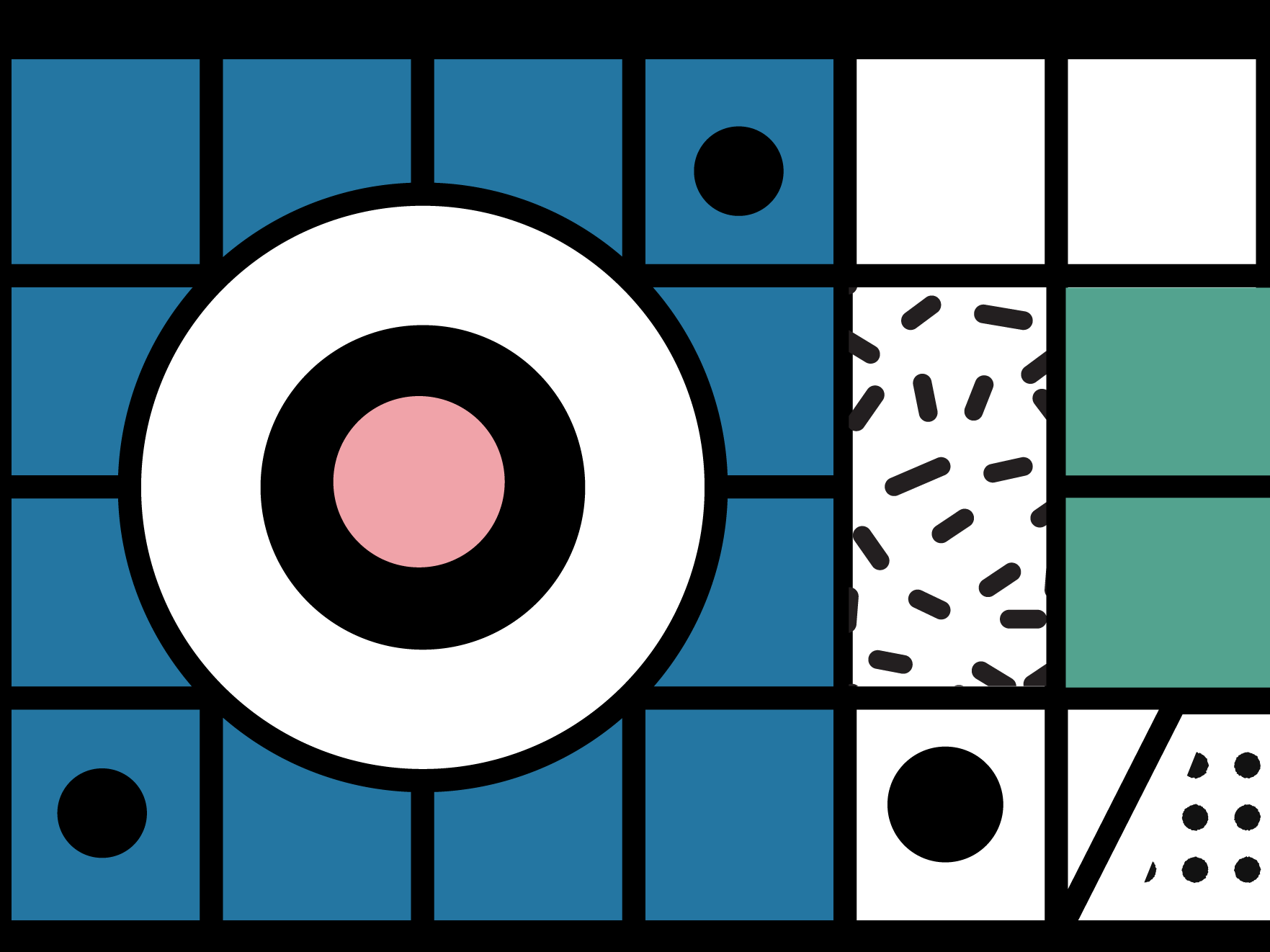
3601 W. William Cannon Drive
Reworking classic Birds motifs—disco balls, speakers, and cassette tapes—through a Memphis-style lens, this shop amplifies color, pattern, and repetition to create the brand at its most pop.
Architecture & Interiors: Mark Odom Studio
Shop Photography: Andrea Calo
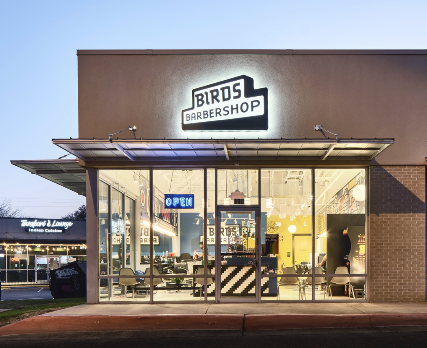
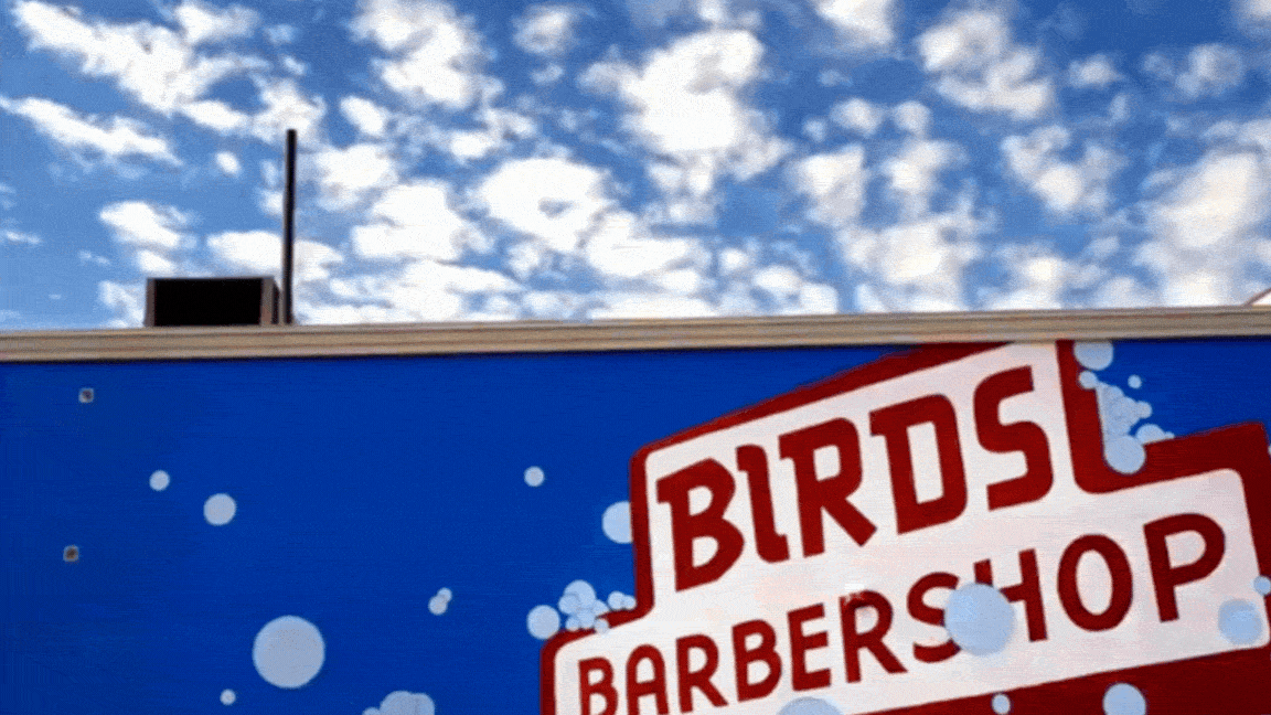
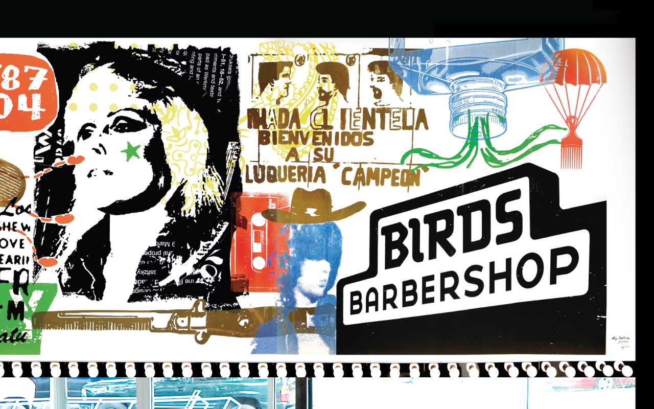
2110 South Lamar Boulevard
The original location served as the launchpad for the Birds brand, anchored by massive, directly screenprinted wall art. Inspired by punk gig posters, vintage barbershop ephemera, and visual puns, it established a visual language that would carry forward for the next two decades.
— THE BIRDS EXPERIENCE —
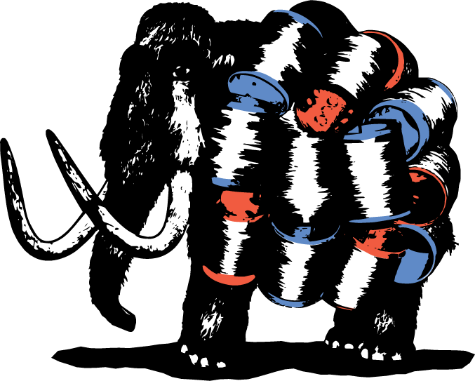
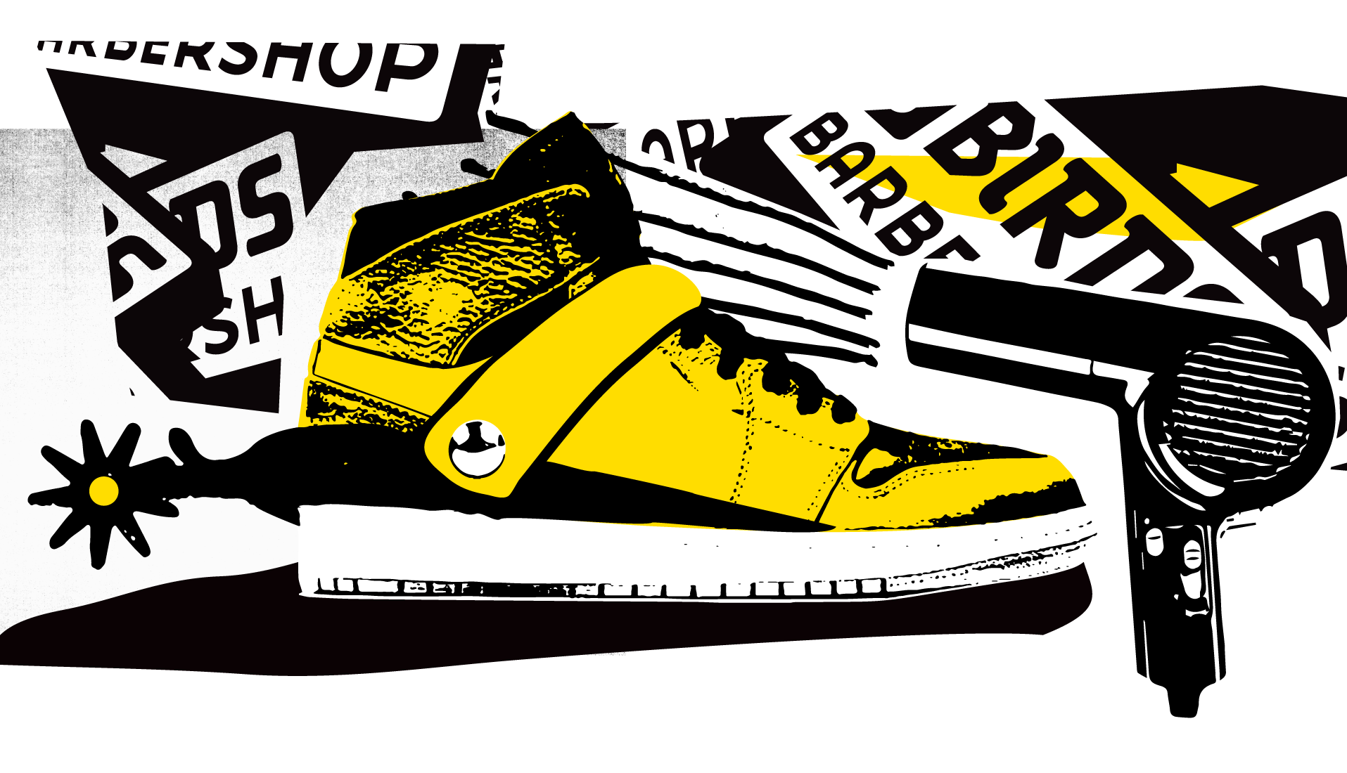
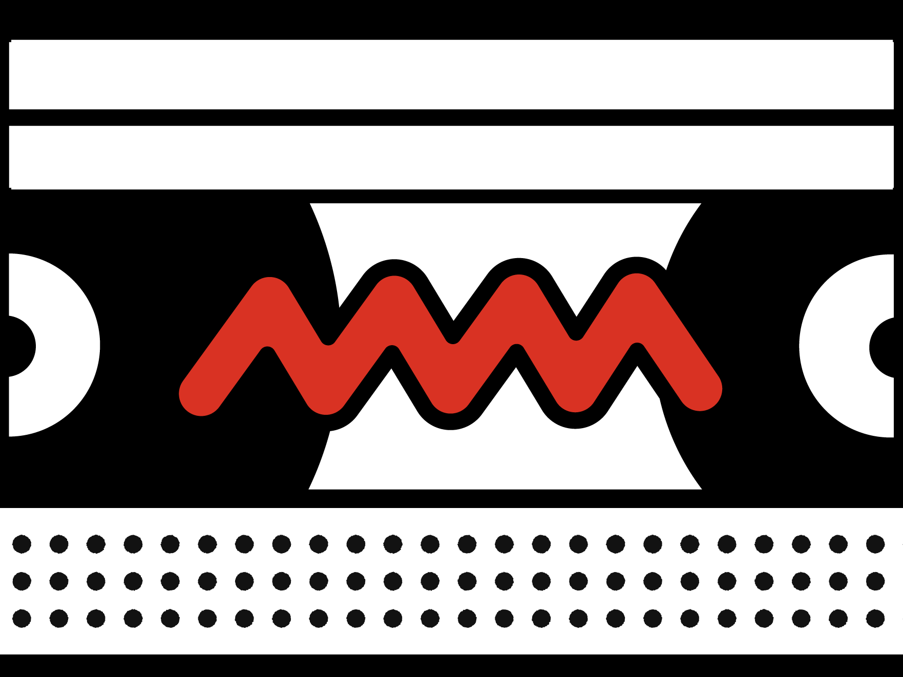
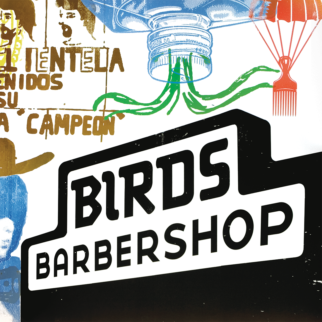
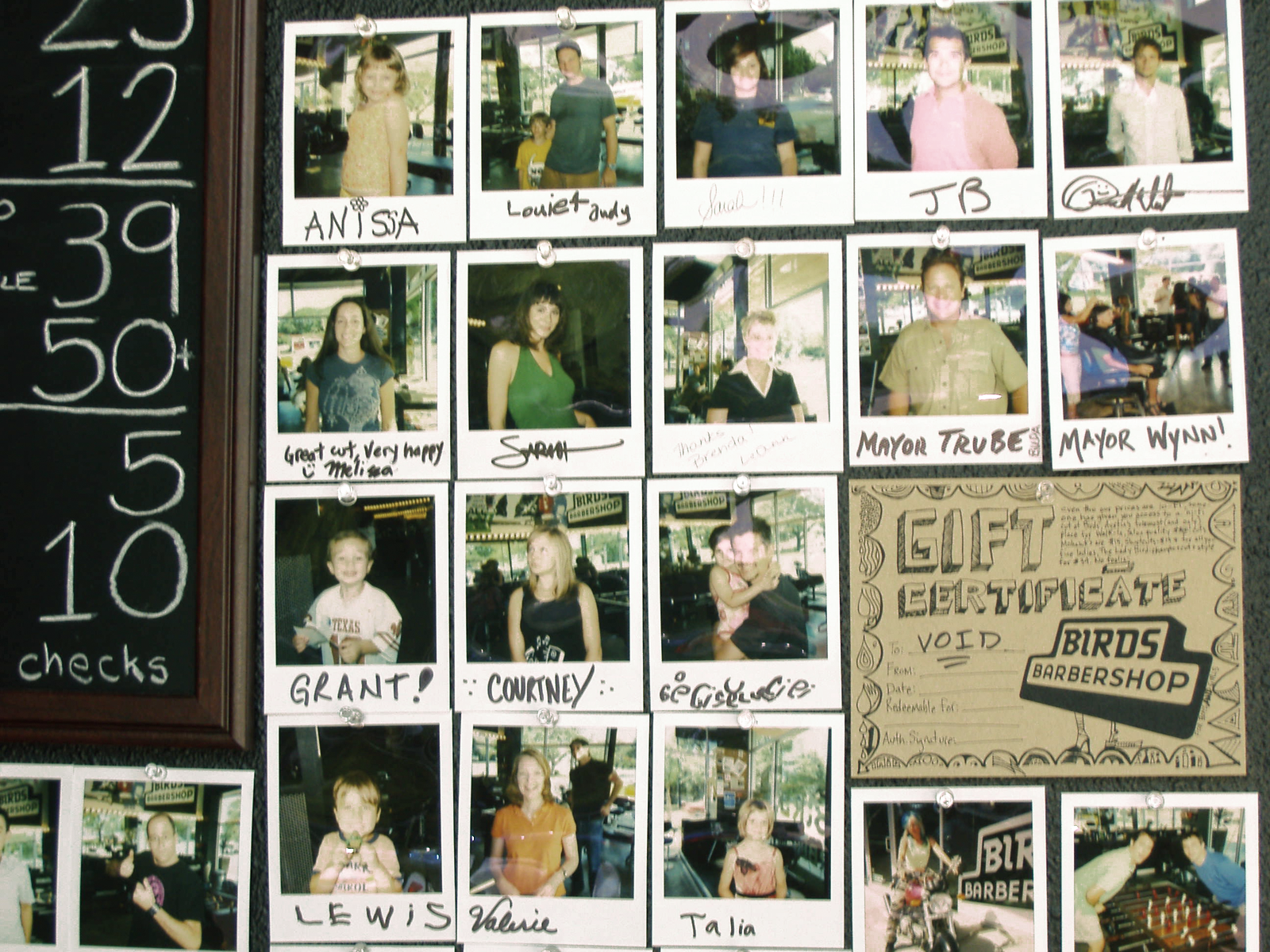
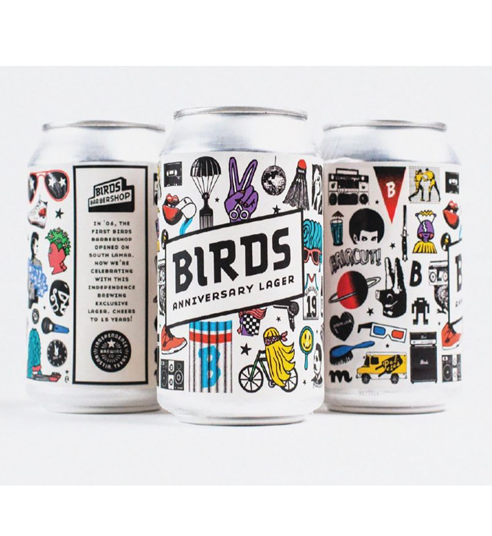
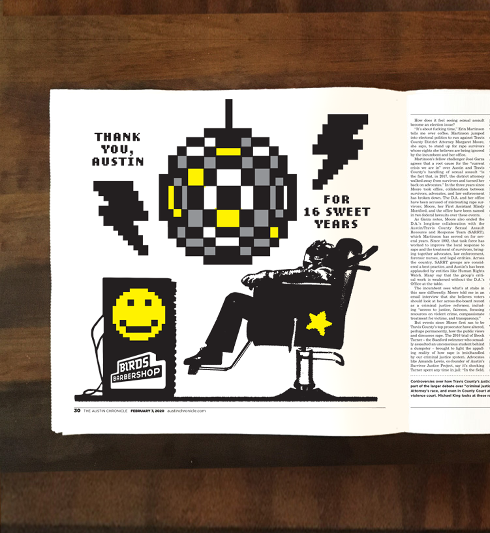
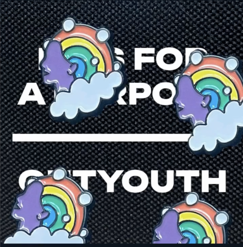
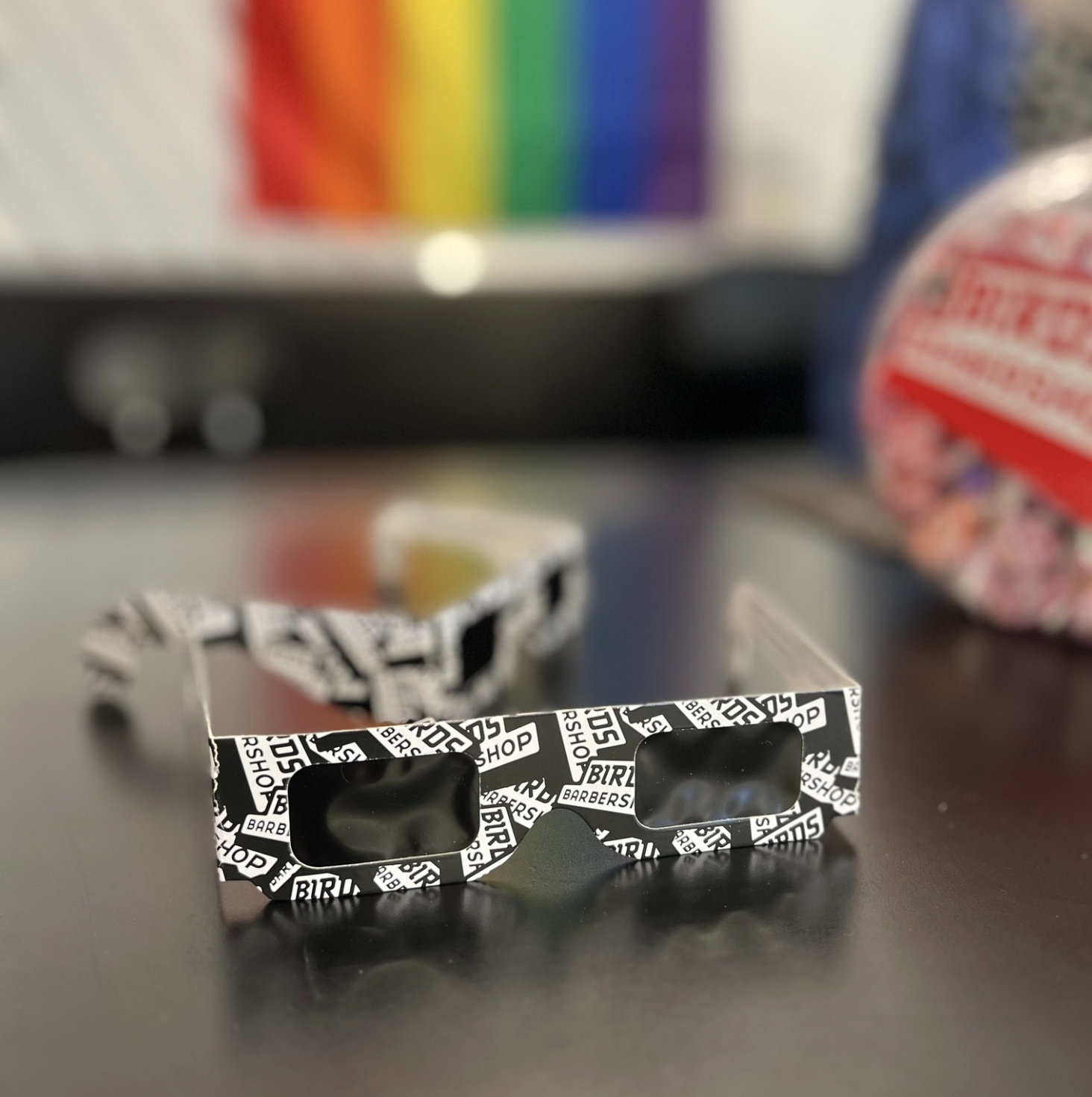
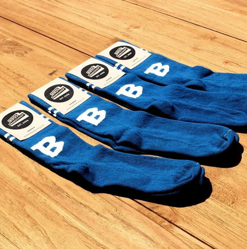
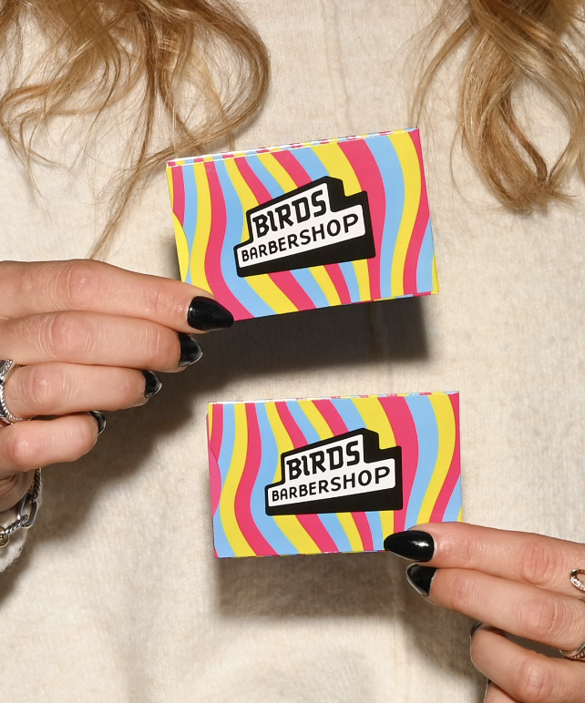
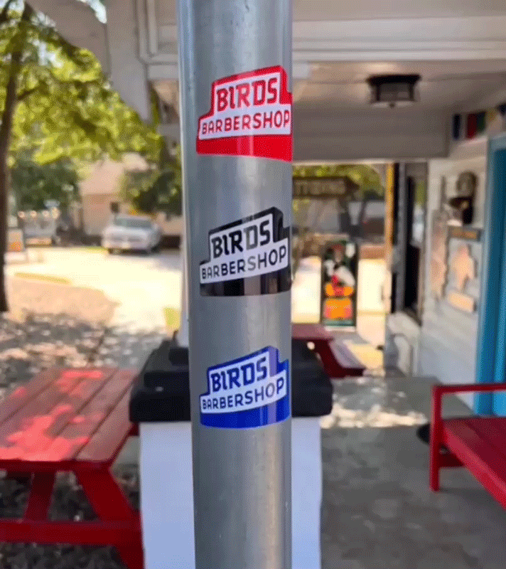
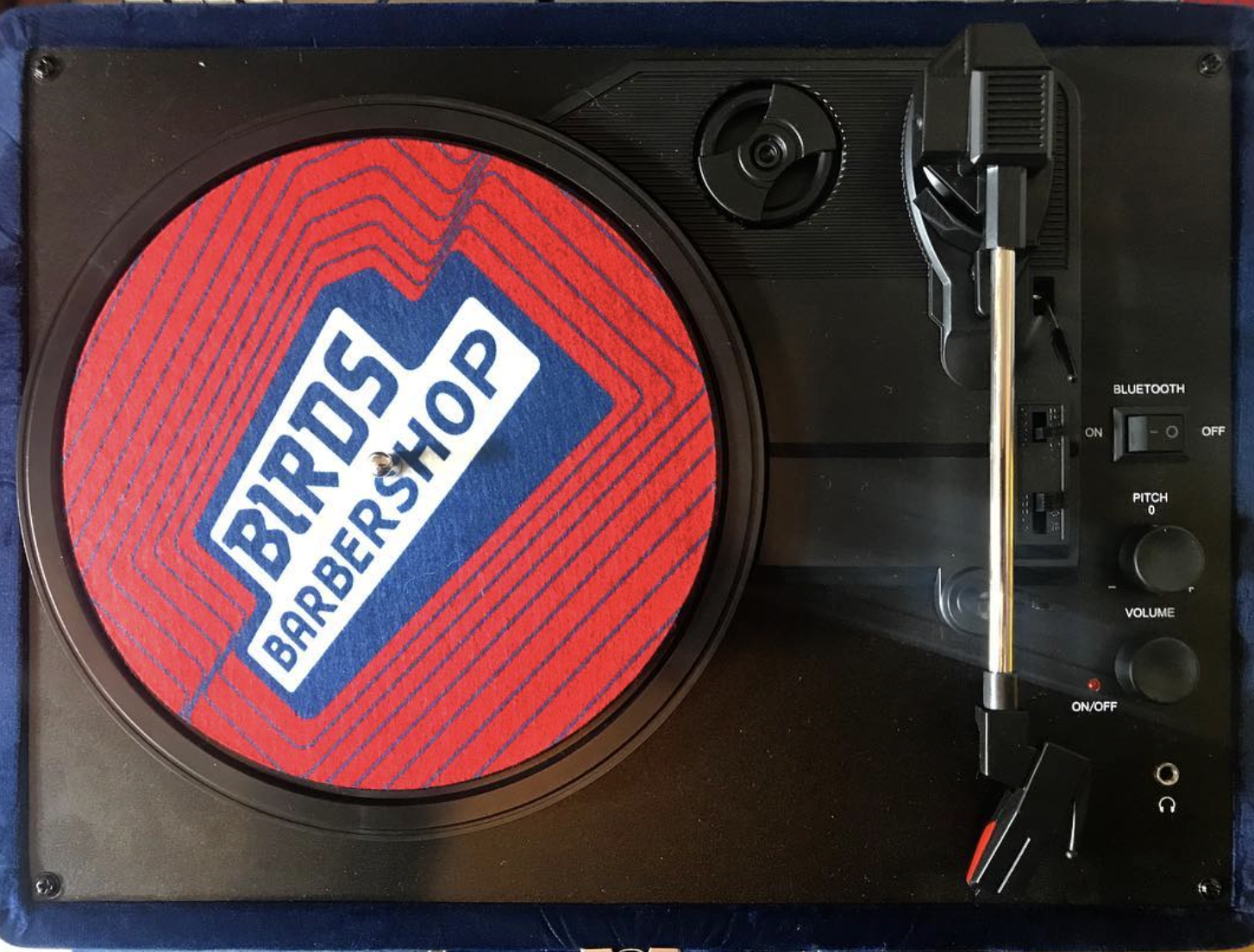
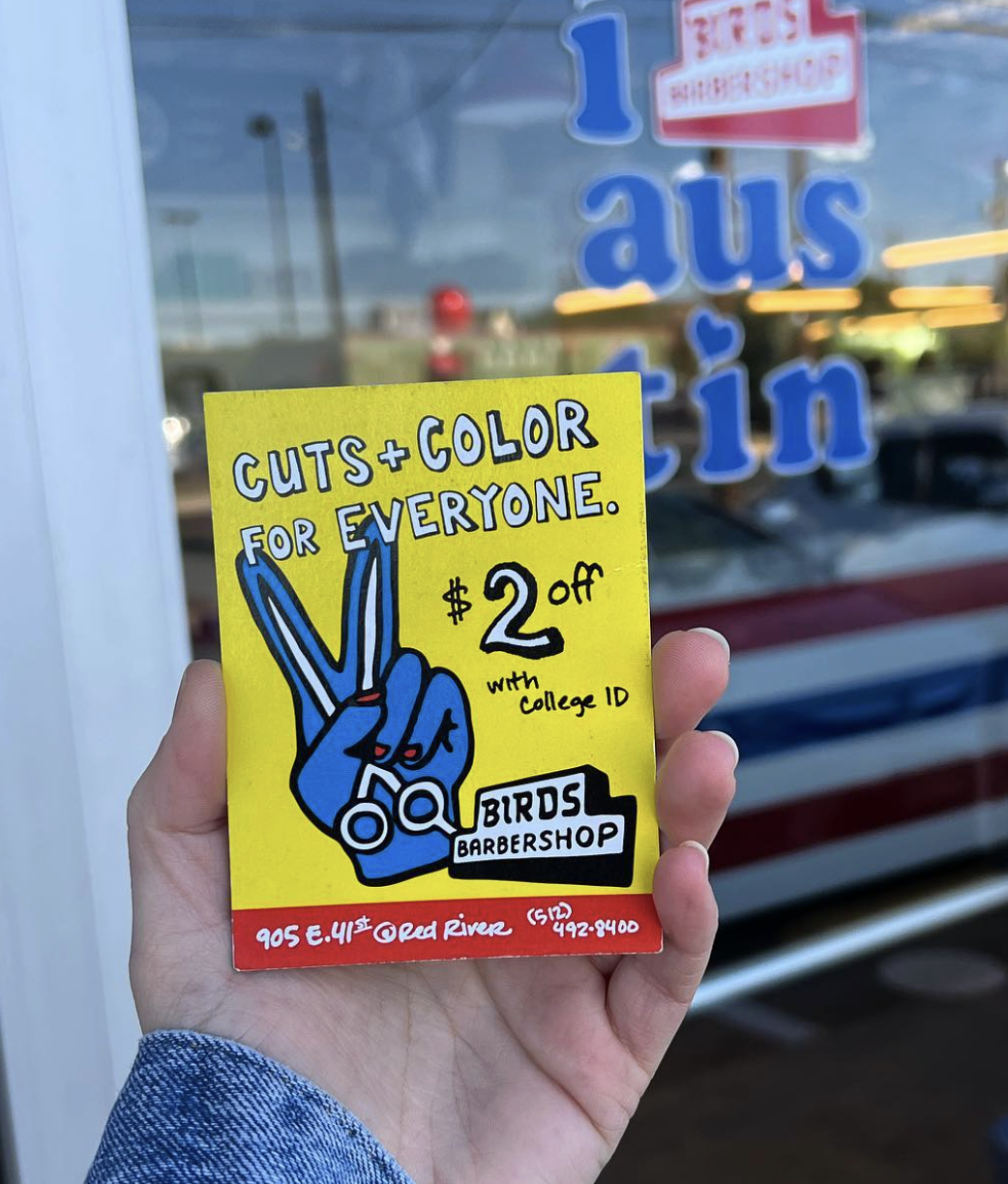
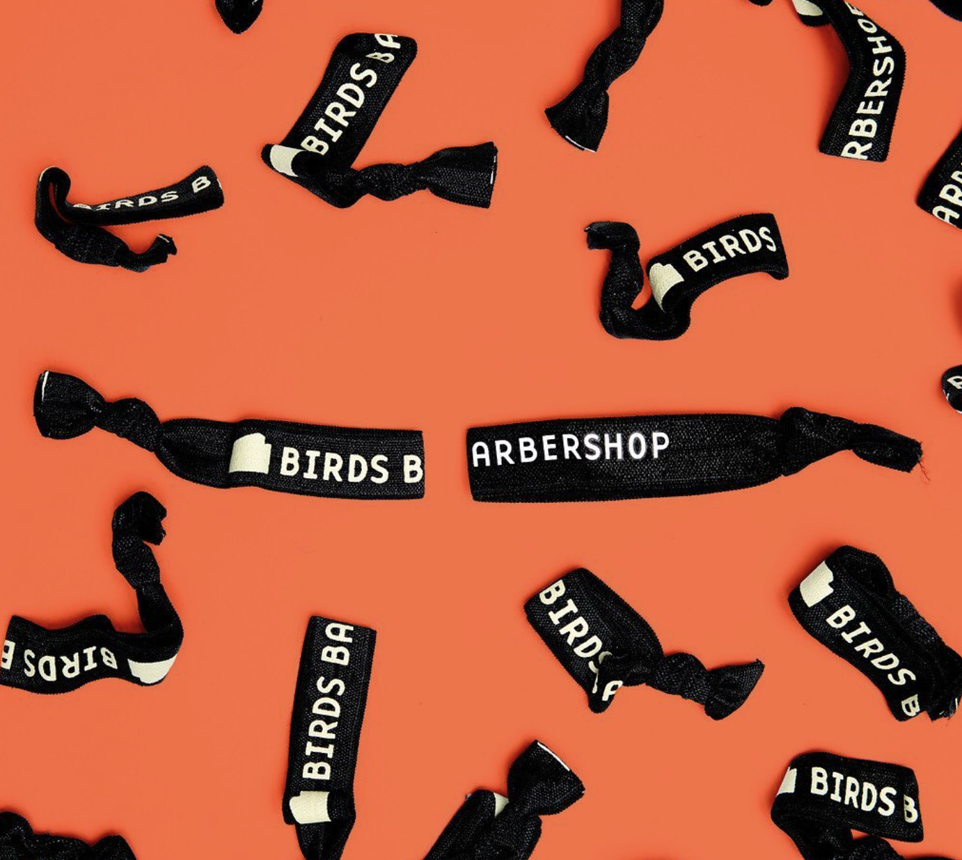
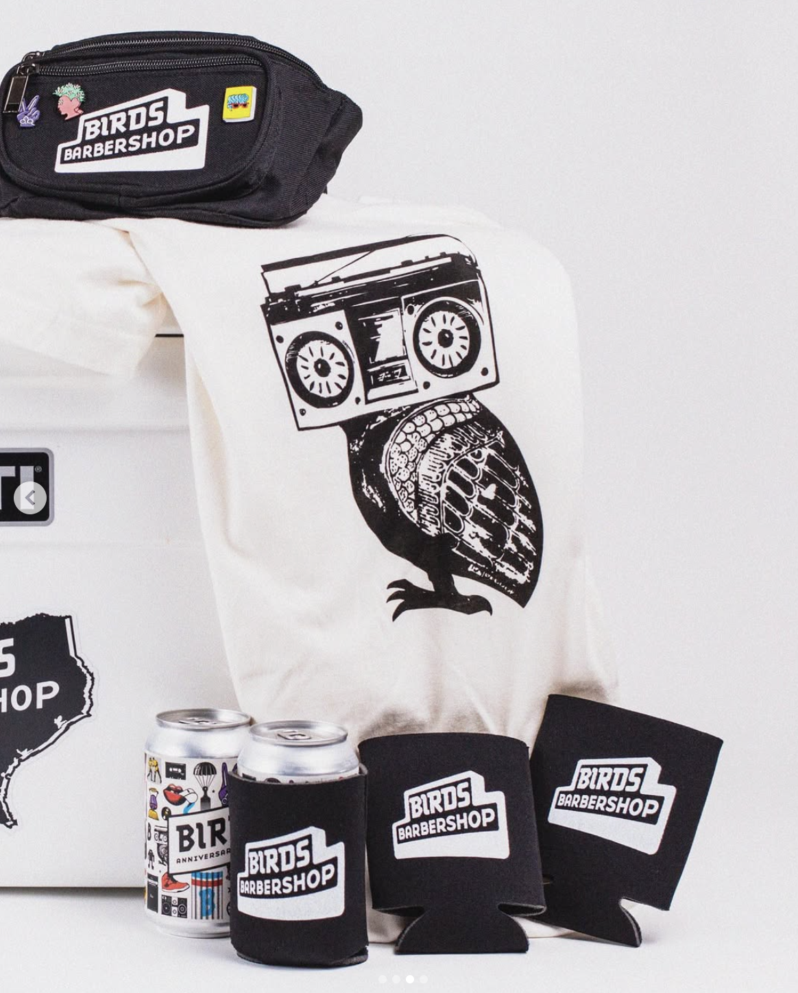
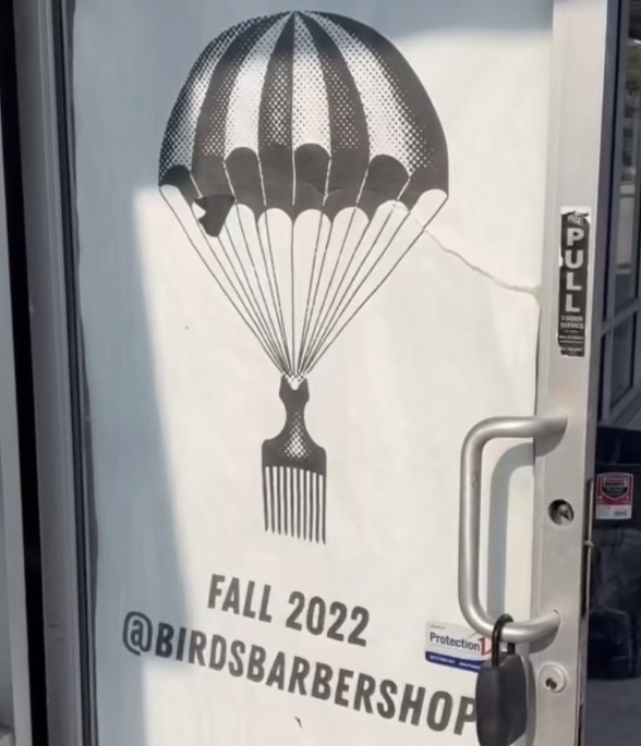
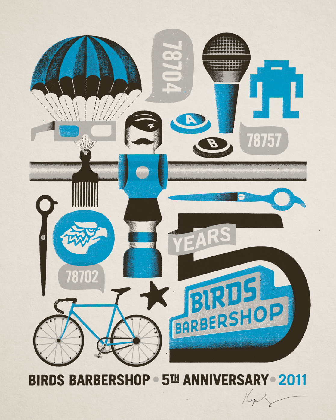
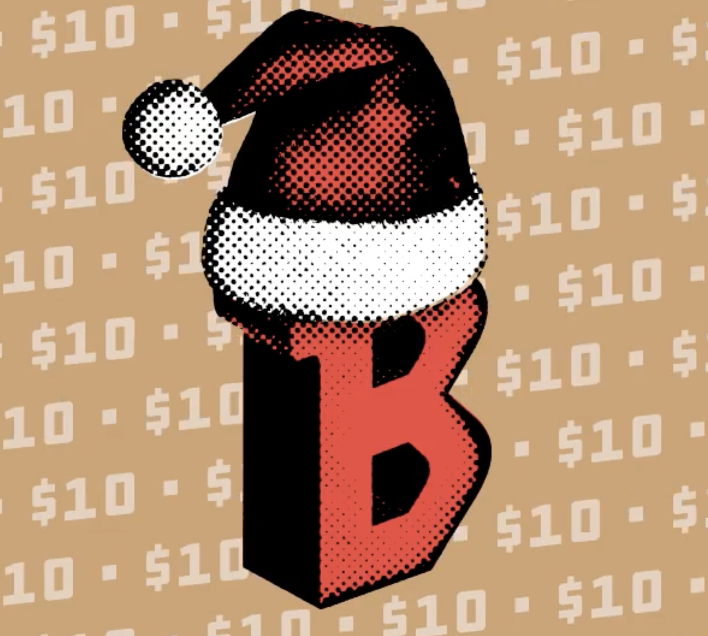
Ephemera
Where the visuals move beyond the shop into print, objects, and everyday artifacts

— THE BIRDS EXPERIENCE —
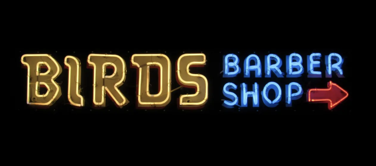
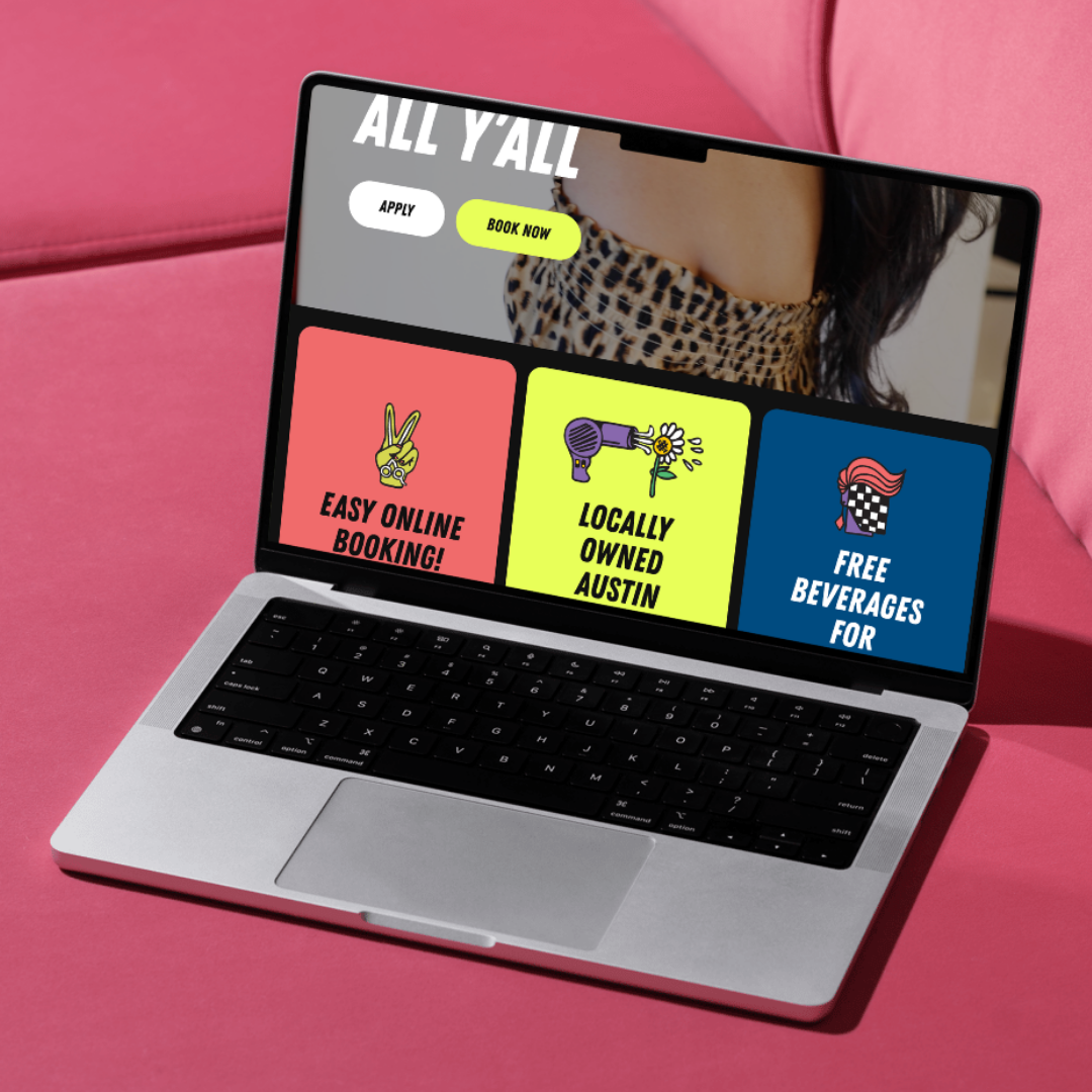
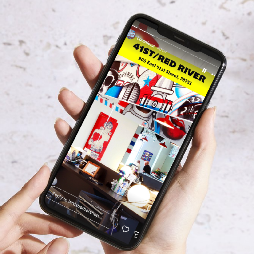
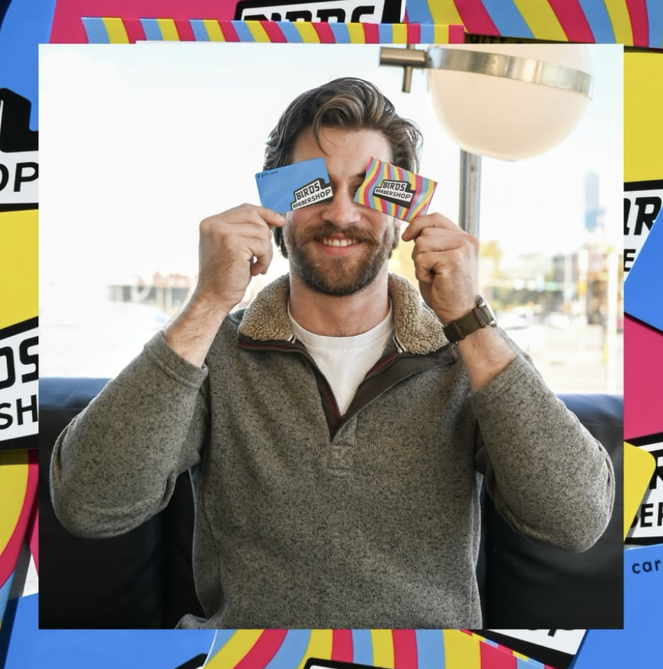
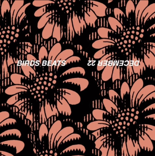
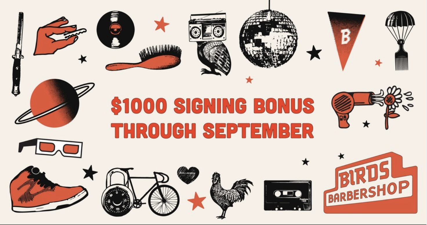
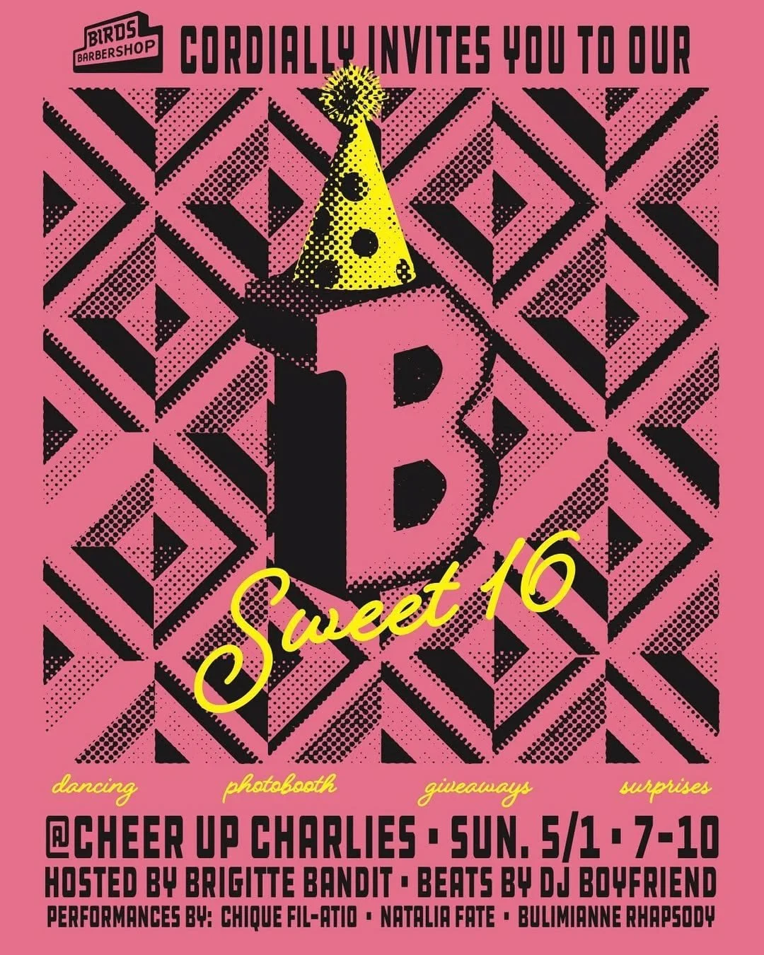
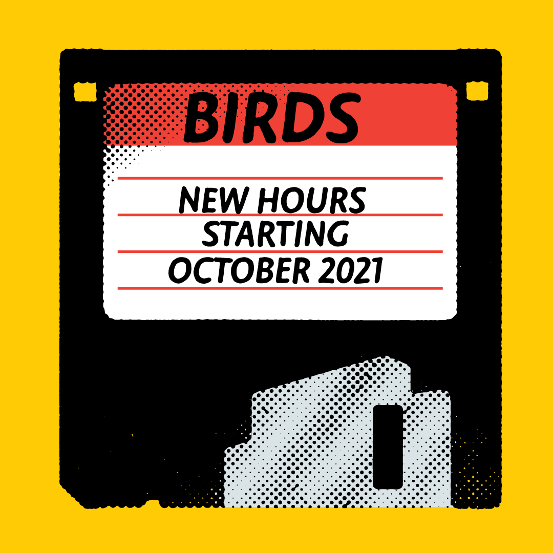
Digital Messaging
Extending the visual language into digital environments—built to scale across formats and moments.

BK: Branding, design, illustration
Birds Team: Additional Digital/Ephemera
Logo designed while at Door Number 3
Thanks: Michael Portman, Erin Portman, Karly Hand, Jeremy Nguyen, Jason Rapaport, Prentice Howe